고정 헤더 영역
상세 컨텐츠
본문
반응형
1. 기본 레이아웃

<!DOCTYPE html>
<html>
<head>
    <title>Page Title</title>
    <style>
        body {
            font-family: Arial, sans-serif;
        }
        header {
            background-color: #f8f9fa;
            padding: 20px;
            margin: 10px;
            border: 1px solid #ddd;
        }
        nav {
            background-color: #e9ecef;
            padding: 20px;
            margin: 10px;
            border: 1px solid #ddd;
        }
        main {
            background-color: #dee2e6;
            padding: 20px;
            margin: 10px;
            border: 1px solid #ddd;
        }
        footer {
            background-color: #ced4da;
            padding: 20px;
            margin: 10px;
            border: 1px solid #ddd;
        }
    </style>
</head>
<body>
    <header>
        <h1>Header</h1>
    </header>
    <nav>
        <p>Navigation</p>
    </nav>
    <main>
        <h2>Main Content</h2>
        <p>Some text...</p>
    </main>
    <footer>
        <p>Footer</p>
    </footer>
</body>
</html>
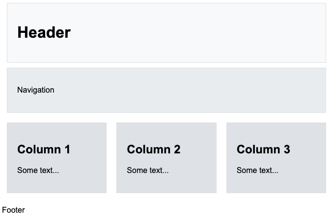
2. 컬럼 레이아웃
<!DOCTYPE html>
<html>
<head>
    <title>Page Title</title>
    <style>
        body {
            font-family: Arial, sans-serif;
        }
        header {
            background-color: #f8f9fa;
            padding: 20px;
            margin: 10px;
            border: 1px solid #ddd;
        }
        nav {
            background-color: #e9ecef;
            padding: 20px;
            margin: 10px;
            border: 1px solid #ddd;
        }
        #columns {
            display: flex;
        }
        #columns section {
            background-color: #dee2e6;
            flex: 1;
            padding: 20px;
            margin: 10px;
            border: 1px solid #ddd;
        }
    </style>
</head>
<body>
    <header>
        <h1>Header</h1>
    </header>
    <nav>
        <p>Navigation</p>
    </nav>
    <div id="columns">
        <section>
            <h2>Column 1</h2>
            <p>Some text...</p>
        </section>
        <section>
            <h2>Column 2</h2>
            <p>Some text...</p>
        </section>
        <section>
            <h2>Column 3</h2>
            <p>Some text...</p>
        </section>
    </div>
    <footer>
        <p>Footer</p>
    </footer>
</body>
</html>
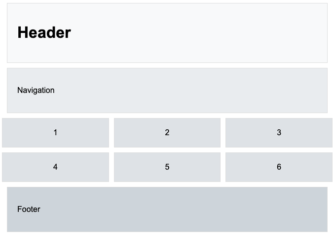
3. 그리드 레이아웃
<!DOCTYPE html>
<html>
<head>
    <title>Page Title</title>
    <style>
        body {
            font-family: Arial, sans-serif;
        }
        header {
            background-color: #f8f9fa;
            padding: 20px;
            margin: 10px;
            border: 1px solid #ddd;
        }
        nav {
            background-color: #e9ecef;
            padding: 20px;
            margin: 10px;
            border: 1px solid #ddd;
        }
        #grid {
            display: grid;
            grid-template-columns: repeat(3, 1fr);
            gap: 10px;
        }
        .grid-item {
            background-color: #dee2e6;
            padding: 20px;
            text-align: center;
            border: 1px solid #ddd;
        }
        footer {
            background-color: #ced4da;
            padding: 20px;
            margin: 10px;
            border: 1px solid #ddd;
        }
    </style>
</head>
<body>
    <header>
        <h1>Header</h1>
    </header>
    <nav>
        <p>Navigation</p>
    </nav>
    <div id="grid">
        <div class="grid-item">1</div>
        <div class="grid-item">2</div>
        <div class="grid-item">3</div>
        <div class="grid-item">4</div>
        <div class="grid-item">5</div>
        <div class="grid-item">6</div>
    </div>
    <footer>
        <p>Footer</p>
    </footer>
</body>
</html>
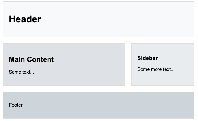
4. 단순한 2칼럼 레이아웃
<!DOCTYPE html>
<html>
<head>
    <title>Page Title</title>
    <style>
        body {
            font-family: Arial, sans-serif;
        }
        header {
            background-color: #f8f9fa;
            padding: 20px;
            margin: 10px;
            border: 1px solid #ddd;
        }
        #columns {
            display: flex;
            justify-content: space-between;
        }
        #left-column {
            background-color: #dee2e6;
            width: 65%;
            padding: 20px;
            margin: 10px;
            border: 1px solid #ddd;
        }
        #right-column {
            background-color: #e9ecef;
            width: 30%;
            padding: 20px;
            margin: 10px;
            border: 1px solid #ddd;
        }
        footer {
            background-color: #ced4da;
            padding: 20px;
            margin: 10px;
            border: 1px solid #ddd;
        }
    </style>
</head>
<body>
    <header>
        <h1>Header</h1>
    </header>
    <div id="columns">
        <div id="left-column">
            <h2>Main Content</h2>
            <p>Some text...</p>
        </div>
        <div id="right-column">
            <h3>Sidebar</h3>
            <p>Some more text...</p>
        </div>
    </div>
    <footer>
        <p>Footer</p>
    </footer>
</body>
</html>
5. 단순한 3칼럼 레이아웃

<!DOCTYPE html>
<html>
<head>
    <title>Page Title</title>
    <style>
        body {
            font-family: Arial, sans-serif;
        }
        header {
            background-color: #f8f9fa;
            padding: 20px;
            margin: 10px;
            border: 1px solid #ddd;
        }
        #columns {
            display: flex;
            justify-content: space-between;
        }
        .column {
            background-color: #dee2e6;
            width: 30%;
            padding: 20px;
            margin: 10px;
            border: 1px solid #ddd;
        }
        footer {
            background-color: #ced4da;
            padding: 20px;
            margin: 10px;
            border: 1px solid #ddd;
        }
    </style>
</head>
<body>
    <header>
        <h1>Header</h1>
    </header>
    <div id="columns">
        <div class="column">
            <h2>Column 1</h2>
            <p>Some text...</p>
        </div>
        <div class="column">
            <h2>Column 2</h2>
            <p>Some more text...</p>
        </div>
        <div class="column">
            <h2>Column 3</h2>
            <p>Even more text...</p>
        </div>
    </div>
    <footer>
        <p>Footer</p>
    </footer>
</body>
</html>
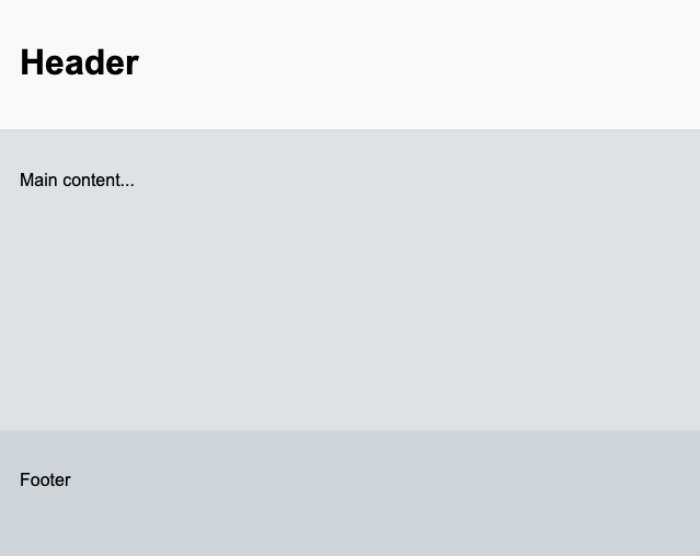
6. 비율 조절 가능한 레이아웃
<!DOCTYPE html>
<html>
<head>
    <title>Page Title</title>
    <style>
        body {
            font-family: Arial, sans-serif;
            display: flex;
            flex-direction: column;
            height: 100vh;
            margin: 0;
        }
        header {
            background-color: #f8f9fa;
            padding: 20px;
            flex: 1;
            border: 1px solid #ddd;
        }
        main {
            background-color: #dee2e6;
            padding: 20px;
            flex: 3;
            border: 1px solid #ddd;
        }
        footer {
            background-color: #ced4da;
            padding: 20px;
            flex: 1;
            border: 1px solid #ddd;
        }
    </style>
</head>
<body>
    <header>
        <h1>Header</h1>
    </header>
    <main>
        <p>Main content...</p>
    </main>
    <footer>
        <p>Footer</p>
    </footer>
</body>
</html>
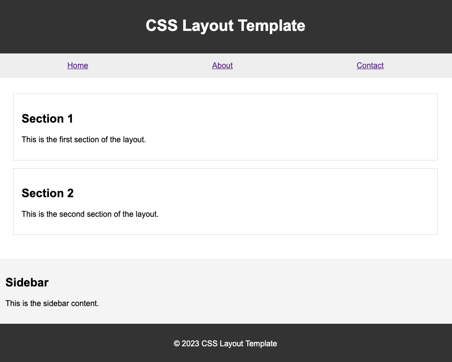
7. 상단메뉴 레이아웃
<!DOCTYPE html>
<html lang="en">
<head>
<meta charset="UTF-8">
<meta name="viewport" content="width=device-width, initial-scale=1.0">
<title>CSS Layout Template</title>
<style>
body {
margin: 0;
font-family: Arial, sans-serif;
}
header {
background-color: #333;
color: #fff;
padding: 1rem;
text-align: center;
}
nav {
background-color: #eee;
padding: 1rem;
}
nav ul {
list-style: none;
margin: 0;
padding: 0;
display: flex;
justify-content: space-around;
}
section {
padding: 2rem;
}
aside {
background-color: #f4f4f4;
padding: 1rem;
}
article {
background-color: #fff;
border: 1px solid #ddd;
padding: 1rem;
margin-bottom: 1rem;
}
footer {
background-color: #333;
color: #fff;
padding: 1rem;
text-align: center;
}
</style>
</head>
<body>
<header>
<h1>CSS Layout Template</h1>
</header>
<nav>
<ul>
<li><a href="#">Home</a></li>
<li><a href="#">About</a></li>
<li><a href="#">Contact</a></li>
</ul>
</nav>
<section>
<article>
<h2>Section 1</h2>
<p>This is the first section of the layout.</p>
</article>
<article>
<h2>Section 2</h2>
<p>This is the second section of the layout.</p>
</article>
</section>
<aside>
<h2>Sidebar</h2>
<p>This is the sidebar content.</p>
</aside>
<footer>
<p>© 2023 CSS Layout Template</p>
</footer>
</body>
</html>
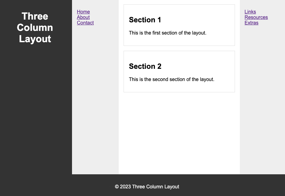
8. 3컬럼 레이아웃
<!DOCTYPE html>
<html lang="en">
<head>
<meta charset="UTF-8">
<meta name="viewport" content="width=device-width, initial-scale=1.0">
<title>Three Column Layout</title>
<style>
body {
margin: 0;
font-family: Arial, sans-serif;
display: flex;
justify-content: space-between;
}
header, footer {
background-color: #333;
color: #fff;
padding: 1rem;
text-align: center;
}
nav, aside {
background-color: #eee;
padding: 1rem;
width: 20%;
height: calc(100vh - 2rem);
overflow: auto;
}
nav ul, aside ul {
list-style: none;
padding: 0;
}
section {
padding: 1rem;
width: 60%;
height: calc(100vh - 2rem);
overflow: auto;
}
article {
background-color: #fff;
border: 1px solid #ddd;
padding: 1rem;
margin-bottom: 1rem;
}
footer {
position: fixed;
bottom: 0;
width: 100%;
}
</style>
</head>
<body>
<header>
<h1>Three Column Layout</h1>
</header>
<nav>
<ul>
<li><a href="#">Home</a></li>
<li><a href="#">About</a></li>
<li><a href="#">Contact</a></li>
</ul>
</nav>
<section>
<article>
<h2>Section 1</h2>
<p>This is the first section of the layout.</p>
</article>
<article>
<h2>Section 2</h2>
<p>This is the second section of the layout.</p>
</article>
</section>
<aside>
<ul>
<li><a href="#">Links</a></li>
<li><a href="#">Resources</a></li>
<li><a href="#">Extras</a></li>
</ul>
</aside>
<footer>
<p>© 2023 Three Column Layout</p>
</footer>
</body>
</html>
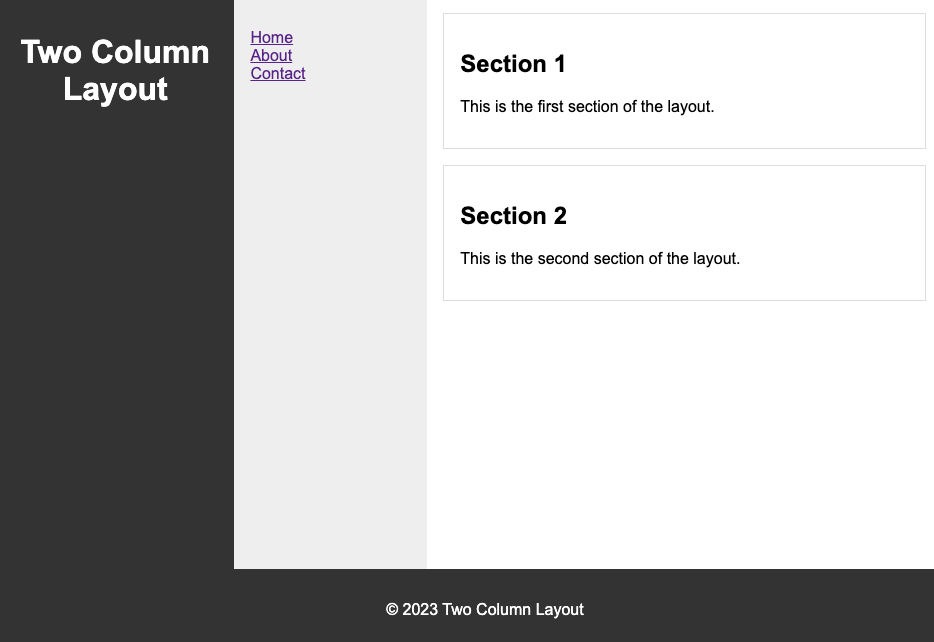
9. 2컬럼 레이아웃
<!DOCTYPE html>
<html lang="en">
<head>
<meta charset="UTF-8">
<meta name="viewport" content="width=device-width, initial-scale=1.0">
<title>Two Column Layout</title>
<style>
body {
margin: 0;
font-family: Arial, sans-serif;
display: flex;
justify-content: space-between;
}
header, footer {
background-color: #333;
color: #fff;
padding: 1rem;
text-align: center;
}
nav {
background-color: #eee;
padding: 1rem;
width: 25%;
height: calc(100vh - 2rem);
overflow: auto;
}
nav ul {
list-style: none;
padding: 0;
}
section {
padding: 1rem;
width: 75%;
height: calc(100vh - 2rem);
overflow: auto;
}
article {
background-color: #fff;
border: 1px solid #ddd;
padding: 1rem;
margin-bottom: 1rem;
}
aside {
background-color: #f4f4f4;
padding: 1rem;
}
footer {
position: fixed;
bottom: 0;
width: 100%;
}
</style>
</head>
<body>
<header>
<h1>Two Column Layout</h1>
</header>
<nav>
<ul>
<li><a href="#">Home</a></li>
<li><a href="#">About</a></li>
<li><a href="#">Contact</a></li>
</ul>
</nav>
<section>
<article>
<h2>Section 1</h2>
<p>This is the first section of the layout.</p>
</article>
<article>
<h2>Section 2</h2>
<p>This is the second section of the layout.</p>
</article>
</section>
<footer>
<p>© 2023 Two Column Layout</p>
</footer>
</body>
</html>
반응형
'HTML&CSS' 카테고리의 다른 글
| <ul> <li> horizontal(가로) 드롭다운 메뉴 만들기: CSS와 애니메이션 활용 (0) | 2024.01.08 |
|---|---|
| CSS로 텍스트 '...' 처리하는 방법 (2) | 2024.01.08 |
| CSS에서의 최신 기능들: CSS Grid Level 2 및 Subgrid (0) | 2024.01.07 |
| CSS와 Web Accessibility: 접근성을 고려한 디자인 (3) | 2024.01.07 |
| CSS에서의 상속과 우선순위 이해하기 (2) | 2023.12.27 |


